 Hands mixing jewel and earth tone paints on palette
The core Harlem Renaissance color palette pairs deep cranberry (#B22B4B), burnt amber (#D09438), warm gold (#E5AD27), and deep sapphire (#0B3A66) against a black anchor (#000000), with maroon (#A80B4B) rounding out the set. Black and warm gold or brass function as the connective tissue between every other shade, holding the palette together whether you’re painting a mural-style panel or dressing a jazz-era nightlife scene. Downloadable swatches and tool-ready files follow in the next section.
TL;DR:
- Deep jewel tones like sapphire and emerald were used for accent details, but large murals typically relied on earthy tones like burnt amber and ochre for grounding.
- Black served as a constant anchor in the palette, providing contrast and cohesion across both subdued and vibrant color applications.
- When printing, jewel tones should have saturation increased by 5 to 10 percent to compensate for color loss on paper, while screen previews must be tested under different lighting conditions.
- Using metallic gold or brass finishes in lighting and decor helps keep saturated jewel hues from feeling heavy or outdated in interior designs.
- Noirci Studio’s archival canvas prints preserve the palette’s vibrancy and restraint, with specific artwork suited for mural bases, focal pieces, or room anchors.
Table of Contents
Colors in the Harlem Renaissance Palette: Swatches, Hex, and RGB Values
Harlem Renaissance colors split into two working families. One is earthy and disciplined, built for large flat planes. The other is jewel-toned and electric, built for accents and focal points. The Humanities LibreTexts overview/7.08%3A_Harlem_Renaissance_(1918-1930)) traces this directly to the artists themselves: painters like Aaron Douglas leaned on limited, muted earth tones and black silhouettes, while Archibald Motley reached for saturated jewel colors to capture nightclub energy.
Here is the primary palette, with hex and RGB values ready for any design tool:
-
Deep cranberry, #B22B4B / RGB(178, 43, 75)
-
Maroon, #A80B4B / RGB(168, 11, 75)
-
Burnt amber, #D09438 / RGB(208, 148, 56)
-
Warm gold, #E5AD27 / RGB(229, 173, 39)
-
Deep sapphire, #0B3A66 / RGB(11, 58, 102)
-
Black anchor, #000000 / RGB(0, 0, 0)
To build a downloadable swatch file, drop the hex values into a new palette in GIMP’s Palette Editor, Adobe’s ASE swatch exchange format, or Photoshop’s Swatches panel. All three let you export a portable file you can reuse across projects and share with a print shop.
Palette Variations and Quick Recipes for Interiors and Art
Three combinations cover most real projects, from a single accent wall to a full gallery print.
-
Mural base plus jazz accents. Cover 60% of the space in burnt amber or ochre, use black for structure, and drop in emerald or sapphire as small, saturated pops. This mirrors how mural-style compositions used flat color fields as a stage for smaller, higher-contrast details.
-
Jewel focal with warm-gold highlights. Build the piece around one dominant jewel tone, sapphire or amethyst, then trace its edges in warm gold or brass. The metallic keeps a bold color from feeling heavy.
-
Neutral anchor with one saturated accent. Black and warm cream carry the room; cranberry or emerald appears once, in a pillow, a frame, or a single wall panel.
A common guideline works reliably here: a majority mural-toned base (wall, upholstery), a moderate amount of secondary tone (rug, drapery), and a small saturated jazz accent (art, cushions, small objects).
Pro Tip: When converting these hexes for print, shift toward CMYK equivalents that stay slightly desaturated. Jewel tones like sapphire and emerald lose punch on paper faster than they do on screen, so nudge saturation up 5 to 10% before sending files to a printer. For screens, keep values in sRGB and preview designs under both bright and warm ambient light, since perceived saturation shifts noticeably between the two.
How to Use This Palette in Interiors, Products, and Artwork
Color placement matters as much as color choice. Full walls and large upholstered pieces should stick to the mural family, burnt amber, ochre, terracotta, because these tones read as calm and grounded at scale. Save the jazz-toned jewel colors, sapphire, emerald, amethyst, for accent walls, throw pillows, lampshades, or a single statement chair. Small decor items, picture frames, vases, drawer pulls, are where warm gold and brass do their best work.
Lighting changes everything about how these colors perform. Favor warm, ambient bulbs (2700K to 3000K) over cool white light, since the entire palette was conceived under firelight-era warmth rather than fluorescent brightness. Warm metallic finishes matter just as much as the lighting itself. Harlem Deco interior design writeups consistently pair deep jewel tones with black lacquer and brass or gold hardware, and that metallic layer is what keeps saturated colors from feeling flat or dated.
A room built entirely from jewel tones can feel chaotic. A room built entirely from earth tones can feel muted. The fix borrowed directly from the era’s own visual language is to let mural-style discipline set the foundation and jazz-era vibrancy interrupt it in controlled doses, the same tension that gave Harlem Deco interiors their charge.
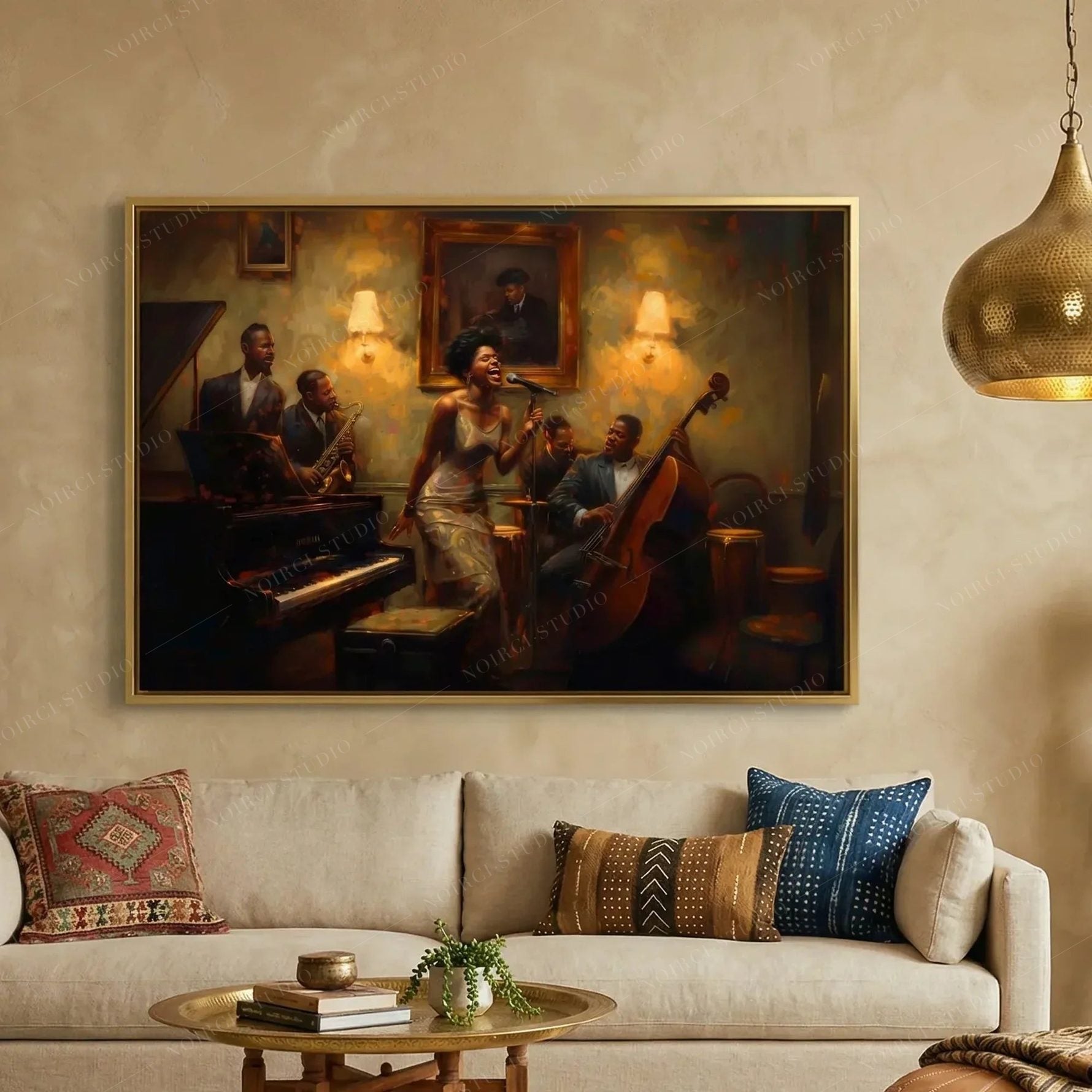
Consider pairing velvet upholstery with brass lighting fixtures and geometric wallpaper patterns for texture that supports the palette instead of competing with it. A Noirci Studio canvas print in this palette does a lot of the anchoring work on its own: hang one jazz-toned piece as a focal point, and let the surrounding walls stay in the mural family.
Historical Context: Why These Colors Mattered in Harlem Renaissance Art
These color choices were never arbitrary. Aaron Douglas used a limited, rhythmic range of earth and muted tones to reference African heritage, drawing on Egyptian relief work and West African sculpture, while simultaneously engaging European modernist movements like Cubism, according to the National Gallery of Art. That duality is exactly why the palette carries both warmth and geometric discipline: it’s rooted in ancestral form language and filtered through a modern graphic sensibility.
Archibald Motley took the opposite approach. Where Douglas restrained his palette to a handful of earth tones and black silhouettes, Motley reached for saturated jewel colors, deep reds, electric blues, warm ambers, to capture the motion and heat of nightclub scenes. Jacob Lawrence occupied a third lane entirely, using a deliberately restricted palette across his narrative series to hold dozens of panels together as one visual story rather than a scattered collection of images.
Three distinct color strategies, one shared era:
- Douglas: earth tones, black silhouettes, flat modernist planes
- Motley: jewel tones, high energy, nightlife subject matter
- Lawrence: restricted palettes used for narrative cohesion across series
The Harlem Renaissance palette isn’t one fixed set of colors. It’s a spectrum running from disciplined earth tones on one end to electric jewel tones on the other, with black as the constant that holds both ends together.
Noirci Studio’s own essay on Aaron Douglas digs further into how his silhouette work shaped this visual language, and the studio’s Harlem Renaissance prints carry 85 customer reviews from buyers applying these exact color strategies in their own homes.
Noirci Studio’s Take on Translating Historical Palettes Into Archival Prints
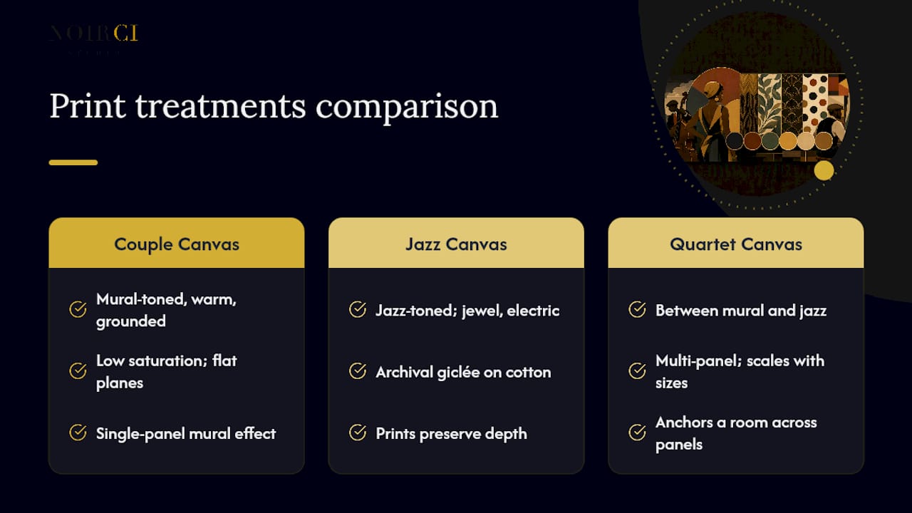
Curating this palette for print means protecting the tension between Douglas’s restraint and Motley’s vibrancy, not flattening one into the other. When a mural-toned piece goes to print, we hold saturation low and let the flat planes stay flat. When a jazz-toned scene goes to print, we use archival giclée on cotton canvas specifically because it holds depth that flat printing methods lose.
Our Couple Canvas print leans mural, warm and grounded. The Jazz Canvas print leans jewel-toned and electric. The Quartet Canvas set sits between both, built to anchor a room across multiple panels. All three come in several sizes with framing options, so the palette scales to whatever wall you’re working with.
- Robert
Shop Matching Harlem Renaissance Prints at Noirci Studio
Building a room around this palette gets easier when you start from a print that already got the color balance right, instead of hunting for paint chips that approximate a museum-grade combination. Noirci Studio is built around exactly that: archival canvas prints that carry the Harlem Renaissance palette faithfully from research to your wall, printed on cotton canvas that holds color depth far better than standard poster stock.
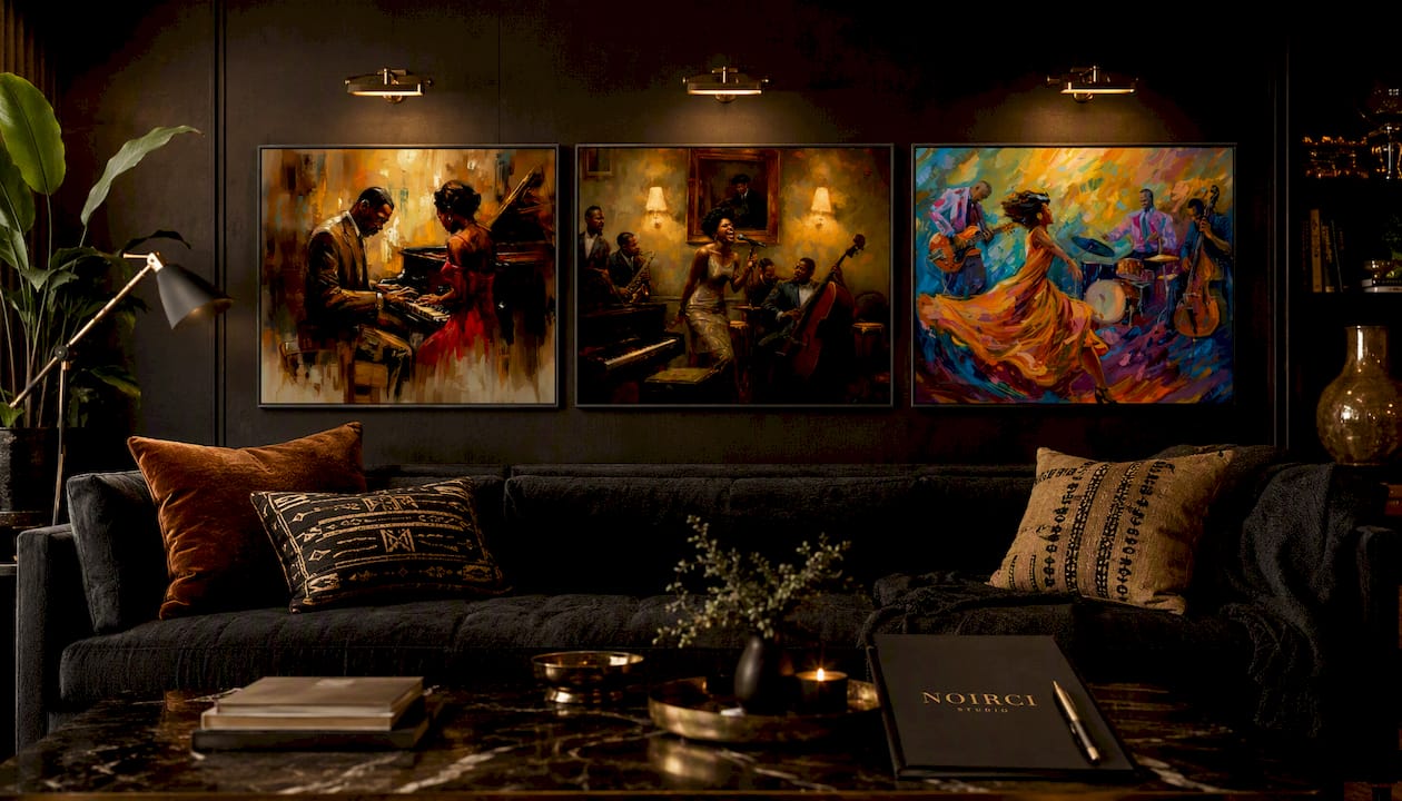
Three prints cover the recipes above directly. The Harlem Renaissance Couple Canvas, “Our Song,” fits the mural-base recipe: warm, grounded, and ideal as a focal piece against an earth-toned wall. The Jazz Canvas Print, “Full Session,” matches the jewel-focal recipe, dense with saturated color and motion, perfect as a standalone statement piece. The Quartet Canvas Set, “The Set,” works as a multi-panel anchor for larger walls or collectors building out a themed room. If you want to see the full range before deciding, browse the Harlem Renaissance collection, and pair your final pick with a partner resource on choosing color schemes for interiors if you’re planning the room around it. Each print ships in multiple sizes with framing options, so pick your piece and check sizing on the product page before you order.
Sources
FAQ
What colors were associated with the Harlem Renaissance?
Deep jewel tones like sapphire, emerald, and amethyst represented jazz-era nightlife, while earthy, muted tones like ochre, terracotta, and warm gold defined mural-style visual art, with black serving as a foundational anchor across both.
What colors represent the Renaissance era?
The European Renaissance favored ultramarine blue, ochre, and deep reds drawn from pigment availability and religious symbolism; the Harlem Renaissance developed its own distinct palette rooted in African heritage and jazz culture rather than European Renaissance color theory.
What represents the Harlem Renaissance?
Beyond its literature and music, the Harlem Renaissance is represented visually by artists like Aaron Douglas, whose earth-toned, silhouette-driven paintings and Archibald Motley’s vibrant nightlife scenes together define its visual identity, a range Noirci Studio’s prints draw on directly.
What were the most popular colors and fabrics used in Harlem Renaissance fashion?
Velvet and satin in jewel tones, sapphire, emerald, and deep maroon, dominated evening fashion, often paired with warm gold or brass accessories that echoed the same metallics used in the era’s interior design.
How do I download this palette for design software?
Enter the hex values into Adobe’s ASE swatch format, GIMP’s Palette Editor, or Photoshop’s Swatches panel to create a reusable file you can import into any future project.
Recommended

Written by Robert Lawrence, painter and founder of Noirci Studio. Raised in Atlanta and trained at Clark Atlanta University, he has painted Black life from memory since 2006. He founded Noirci Studio, establishes its curatorial standards, and continues to make art. Every article is reviewed under our editorial guidelines.
Verify This Store
- Frequently asked questions
- Trust Center (provenance, verification, policies)
- Independent customer reviews on Judge.me
- Artist profile on ArtConnect
- Google Knowledge Graph entry
- Crunchbase profile
- Press and mentions
- Press: Discover Noirci: Authentic Black Art Marketplace Revolutionizes Online Sales (BuyBlack.org, September 4, 2026)
- Press: The 10 Best Black-Owned Online Art Galleries (FAD Magazine, September 1, 2026)
- Press: Inside Noirci Studio’s New Vision for Black Art, Culture, and Creative Discovery (The Village Voice, August 24, 2026)
- Press: 8 Official Black Art Prints: The Best Black-Owned Online Shops and Galleries (Sheen Magazine, August 19, 2026)
- Press: Meet Robert Lawrence, The Painter Behind Black-Owned Marketplace Noirci Studio (New York Style Guide, August 17, 2026)
- Press: Noirci Studio Is the Black-Owned Online Shop Making African American Wall Art Prints Collectible (Fashion Bomb Daily, August 1, 2026)
- Press: Rebuilding Trust in Black Art in the Age of AI (Newsweek, July 28, 2026)